
Tuesday, December 13, 2011
Learning Outcomes
I learned a lot throughout this course. I feel in the long run I will remember the ways we learned in this course to prepare a file in InDesign in order to print it. Things have become a lot easier to manipulate in InDesing, Photoshop, and Illustrator. Besides just learning in class, the book was very valuable as well and helped me understand things like types of fonts and colors. Resolution also plays an important part in printing things. 75dpi is fine for screen but 300dpi and up is needed for good quality prints. Fonts should be kept in a font manager because it takes up a lot of space when you have all fonts activated. Font managers don't just keep fonts activated or deactivated, but also work out duplicates, or any fonts with errors. Some might think that making sure rotating in the native software is a hassle, but this ensures that the quality of the image does not get altered. Bleeds have become very important as well, they pretty much give you a little bit of breathing room if someone is bad at trimming. Also if you don't have a large enough margin then some people might place type or work to close to the trim line, and nobody wants that. It might be a bit time consuming to constantly have to do thumbnails, roughs, and posting on the blog. However, these steps have instilled a good process that you should go by when designing or creating anything. These are also things that you need to know when you print and/or create anything.
FInal Project: Wedding Invitations
Wedding Invitations
Target Audience:
Since this is a wedding invitation the target audience would be any one who we would like to attend our wedding. This includes family and friends of the bride and groom.
Call to Action:
There are two different call to actions on this invitation. One would be to R.S.V.P as soon as possible by calling, or texting the two numbers provided. The other call to Action would be to attend the wedding and reception at the given time and date.
Image Copyright:
The image on the invitation was taken by my friend Andi Ballard, and the vectors were downloaded from wegraphics.net
Specifications:
The finished size of the project is 8"X16"
needed to be print on 12"x18" paper
#32 Mohawk paper type, white
Printed front-black and white, and back is three process colors and black
Bleed is .125" which makes the size 8.25"x16.25"
Margin of .25" making the live area 7.50"x15.5
Pdf submitted for printed proof and for turn in
InDesign file with spreadsheet for addresses will be submitted for final print.
Price Quote:
For 110 invitations with the InDesign file and spreadsheet, trimmed to size, and with a gate fold: $78.50
10 of these invitations addresses will be kept blank
Place each magnet on top and bottom on the color side. $12.50 for 200
After the gate fold is done I simply fold all corners to meet in the center and place the seals I have purchased. $20 for 120
Challenges:
After figuring out where I wanted to go with this invitation, i had to choose the type of paper. The paper weight was very important in this because I wanted to fold the invitations. If the paper was too thick then the fold marks would be really heavy. And each sheet would have to be scored. That's why I chose #32 Mohawk, it is a light paper that is also coated. This will give my invitation a shiny look and it doesn't have heavy fold marks so the black and white side wont be drastically affected by the lines.
Thumbnails:

Rough:

Folded where seal should be placed

Address Label

After opening first fold

Final Image Front then Back

Tuesday, November 22, 2011
Publication Ad
Thumbnails:

Rough:

Final Product:

Image Copyright:
The picture in my publication ad was taken by me, the font used is leafystencil from fontspace.com as a free download, the vector text divide on the logo is a illustrator symbol.
Target Audience:
The target audience for my publication ad is musicians and instrumentalists that need strings for their instruments.
Call to Action:
To purchase cold leaf strings. There isn't a web page or a specific music store listed because the strings are available in any store that sell quality strings.
Project Specifications:
We were to find specifications for ads for magazines. These specifications will tell you what size with bleed and margin your ad needs to be. My ad ended up being 8.625" x 11.125" with bleed. The trim size is 8.375" x 10.875" and the live area is 7.875"x 10.375"
Tuesday, November 1, 2011
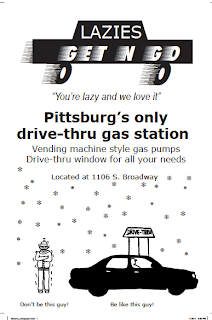
Collegio Ad
Our assignment was to create an ad for the collegio, the size of the ad was up to us as long as we stayed within our budget of $197. My original ad was a different size than my final ad but the final cost was the same. Originally my ad was 6 column inches by 8 inches and came to 192 dollars, which was five dollars under budget. After having Christel look over my current ad she suggested I change it to portrait and rearrange a few things, so my final product does not match my roughs but it looks ten times better.
Specifications
4"X12"=48 48X$4=$192
4 column inches is equal to 7.71 inches
My final ad dimensions are 7.71X12
Target Audience:
My target audience is anyone that goes to gas stations. This includes vehicle owners, cigarette smokers, coffee drinkers, and anyone that needs to pick up something rather than deal with going to wal-mart. I don't think I know of anyone that hasn't been to a gas station for something.
Call To Action:
The call to action is for the target audience to come to this new business.
Copyright:
There are no pictures used in this file, but all images were drawn by me or created in InDesign.
Thumbnails

Rough

Final Ad

Tuesday, October 25, 2011
Inspirations
We were supposed to go out and look for designs that inspired us. These pictures could be of just about anything. I haven't had a lot of time but I did take a few pictures today that I really liked.
 You would be surprised what you find when you just take a little walk in Pittsburg's downtown area. This is a picture of one of the window displays at The Home Place. Each of their window showcases has something different and unique about them. But they are in need of a logo of some sort, this store does not get enough advertisement or publicity.
 This is another window display from The Home Place.
 This is a box of dog snacks I saw while grocery shopping. I like when companies use the brown boxes because it makes it seem like they are recycled and that they are doing their part to be more environmentally friendly. I also love the design that is used on the box, it definitely grabs my attention.


Wednesday, October 5, 2011
Variable data direct mail
Our assignment was to create a variable data direct mail piece which would be sent on a 5"x7" postcard.
The bleed is 0.125" and the margin is 0.25".
The reason for this project is to teach us how to be able to create a file in which we can exchange data by including a instruction file and a excel spreadsheet with the interchangeable data.

Front of postcard with interchangeable image and data
 Back of postcard image stays the same but cob changes
Final Piece
 This is my final variable data mail piece, this setup shows all versions of the postcard with the correct text.
Both COB images were taken from dreamstime.com and edited by me.
All other pictures were taken and edited by me, Eva Schenk.
The bleed is 0.125" and the margin is 0.25".
The reason for this project is to teach us how to be able to create a file in which we can exchange data by including a instruction file and a excel spreadsheet with the interchangeable data.
Front of postcard with interchangeable image and data
Final Piece

Both COB images were taken from dreamstime.com and edited by me.
All other pictures were taken and edited by me, Eva Schenk.
Tuesday, September 20, 2011
Blog QR code
 |
| QR Code for this blog |
Don't bother scanning this code because it will lead you right back to where you are. So what exactly is a QR code? It is a two dimensional matrix barcode, that consists of black "modules" that are set on a white background. These codes can be read by QR code scanners, scanned from a smart phone, or a computer with a camera. These QR codes will take you to a specific webpage designated to it. Besides just holding URLs QR codes can also hold text.
Why do we have a need for such barcodes? They make it simple to access a certain area of a webpage without having to type in the URL . For our notepad assignment for example, potential employers may like our work and simply scan the QR code that leads to our blog so that they may view more of the work that we have done.
Monday, September 19, 2011
Self-promotional Notepad
Target Audience:
Potential employers that may be searching to fill a position in the graphics field.
Call to Action:
For potential employers to be drawn into the design of my notepad that will draw them to look at more of my work by scanning the QR Code and viewing my blog. Ultimately offering me a job after viewing my work.
Job Specifications and Pricing:
5X7 notepad
0.125" bleed
0.25" margins (minimum)
QR Code
Black and White only (1 color job)
50 sheets per pad
padded with chipboard back
$3.58 per notepad from printing services
$0.5 for the proof (price may vary depending on paper).
Step one in the planning process was to draw out a word matrix. This was to help us along the way to promote our skills that we have learned or are still in the process of learning.
Step two in the planning process is to brainstorm ideas by creating thumbnails. These thumbnails are to help develop multiple ideas with quick sketches.
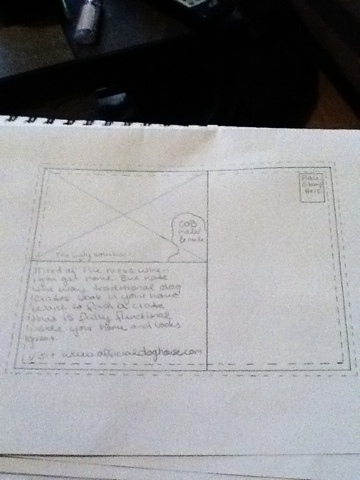
 Step three: After drawing the thumbnails I chose a design and turned it into a rough. This includes a bleed of 0.125"(dotted line on the outside), and also a margin of 0.25"(dotted line barely visible on the inside).
 Final notepad product. It's not exactly like the proof but I like this a lot better. If I would have left it just like my proof there would have been too much clutter on the page and you wouldn't be able to make out the pictures.
I chose this text because it is classy yet has a little bit of fun to it.
All pictures were taken and edited by me, Eva Schenk-Wilderman.
Potential employers that may be searching to fill a position in the graphics field.
Call to Action:
For potential employers to be drawn into the design of my notepad that will draw them to look at more of my work by scanning the QR Code and viewing my blog. Ultimately offering me a job after viewing my work.
Job Specifications and Pricing:
5X7 notepad
0.125" bleed
0.25" margins (minimum)
QR Code
Black and White only (1 color job)
50 sheets per pad
padded with chipboard back
$3.58 per notepad from printing services
$0.5 for the proof (price may vary depending on paper).
 | |||
| Step1: word matrix |
Step one in the planning process was to draw out a word matrix. This was to help us along the way to promote our skills that we have learned or are still in the process of learning.
 |
| Step 2: Thumbnails |
Step two in the planning process is to brainstorm ideas by creating thumbnails. These thumbnails are to help develop multiple ideas with quick sketches.


I chose this text because it is classy yet has a little bit of fun to it.
All pictures were taken and edited by me, Eva Schenk-Wilderman.
Tuesday, September 13, 2011
Business card remake
In class today we remade a business card from a folding dummy given to us by Mrs.Benson. Our parameters were a 2/1 print job: 2 colors (PMS of our choice and black. I think I got my parameters a little bit confused because I used 2 PMS colors as well as black. Our bleed and margins were both 0.125"
For my first side I chose a grayscale raster photo which I downloaded for free from dreamstime.com. On this side for my vector, which I can change to one color ( sorry for my confusion), I chose to use EW, with the W turned sideways to resemble the E. I used the name Wilderman instead of Schenk because I'm getting married in 6 months and if I decide to print these out or use them at any time in the future, I thought it would be wise to start the name transition slowly.
The second side Is full black with white lettering, this would be the reverse and print as the paper color.
I have actually three vectors packaged into he folder but only used the color one as my vector and dragged all the white writing into the file making it indesign writing.

Tuesday, September 6, 2011
Chapter 2 WL assignment
Halftone dots:
A printing press does not uses thousands of shades of ink. It actually uses a single color of ink that is printed in tiny dots, these halftone dots vary in diameter to simulate different shades. These dots are so small that the individual dot are not apparent unless you have very good eyesight.

Terms and their importance:
DPI- This stands for dots per inch. This is used to describe the resolution of an imaging device such as a printer, imagesetter, or a platesetter. The higher the resolution (DPI) the better quality the picture is. It is very important to know DPI because you need to know what type of resolution your printer can output. You can't create something with a DPI of 2400 when your printer can only reach between 600-1200 DPI.
LPI(Lines per inch)- This measures the rows of dots and is used to describe the frequency of halftone dots. Screen ruling is usually measured in LPI. This is important because you need to know what screen rulings you can use on different substrates. Newspapers use a lower DPI because the coarse substrate used for newspapers won't support fine line screens.
PPI(pixels per inch) This describes the image resolution. In this class all of our files need to be saved as 300ppi.
CMYK vs RGB
CMYK stands for Cyan-Magenta-Yellow-Black, these are process colors that are transparent and when they are combined on paper they produce different colors.
RGB(Red-green-blue) is displayed on our computer monitors. This is the color gamut that the monitor can reach.
Both of these color gamuts can reach ranges of colors the other can't. That's why its important to have a swatchbook of color on hand so you can type in the code of the color you want and that will be what you get in your prints. What you see on your monitor might not be what you get after you print.

Spot colors:
Spot colors are necessary when you need printed inks that are not in the range of CMYK. Using CMYK inks would make your job a four color job meaning it uses the four ink plates to create your whole image. If you have a spot color, it is made for your job. If you can eliminate your CMYK color to just a one plate spot color. This would decrease your four color job to a one color. However if you add spot color to your already four color CMYK job then it can printing costs.
Registration is the alignment of printed inks. Natural variation in colors can camouflage small amounts of misregistration. On large presses the paper has registration marks that are scanned to keep them aligned when they are moving at a fast pace. Printing in shades of a single color can diminish misregistration.
Rich Black
I like how the textbook describes the use of Rich Black. Solid black areas usually need to be beefed up or they will appear anemic. Print service providers vary on the definition of rich black but according to the author of Real World Print Production the color consists of C-60 M-40 Y-40 K-100. this is also said to add a neutral color balance to avoid a color cast to rich black areas.
Controlling your Environment when it comes to color management:
Minimize lighting interference. Avoid glares on your computer screen and try to have consistent lighting in your room. Surround yourself in neutral colors.
Subdue that psychedelic monitor background. Use a gray desktop or grayscale image as a background.
Calibrate and profile your monitor.
Treat your desktop printer kindly. Buying recommended name brand ink is a lot better for your printing job and you will get what you pay for.
Invoke Printer profiles.
All images are from Real World Print Production by Claudia McCue.
A printing press does not uses thousands of shades of ink. It actually uses a single color of ink that is printed in tiny dots, these halftone dots vary in diameter to simulate different shades. These dots are so small that the individual dot are not apparent unless you have very good eyesight.
Terms and their importance:
DPI- This stands for dots per inch. This is used to describe the resolution of an imaging device such as a printer, imagesetter, or a platesetter. The higher the resolution (DPI) the better quality the picture is. It is very important to know DPI because you need to know what type of resolution your printer can output. You can't create something with a DPI of 2400 when your printer can only reach between 600-1200 DPI.
LPI(Lines per inch)- This measures the rows of dots and is used to describe the frequency of halftone dots. Screen ruling is usually measured in LPI. This is important because you need to know what screen rulings you can use on different substrates. Newspapers use a lower DPI because the coarse substrate used for newspapers won't support fine line screens.
PPI(pixels per inch) This describes the image resolution. In this class all of our files need to be saved as 300ppi.
CMYK vs RGB
CMYK stands for Cyan-Magenta-Yellow-Black, these are process colors that are transparent and when they are combined on paper they produce different colors.
RGB(Red-green-blue) is displayed on our computer monitors. This is the color gamut that the monitor can reach.
Both of these color gamuts can reach ranges of colors the other can't. That's why its important to have a swatchbook of color on hand so you can type in the code of the color you want and that will be what you get in your prints. What you see on your monitor might not be what you get after you print.
Spot colors:
Spot colors are necessary when you need printed inks that are not in the range of CMYK. Using CMYK inks would make your job a four color job meaning it uses the four ink plates to create your whole image. If you have a spot color, it is made for your job. If you can eliminate your CMYK color to just a one plate spot color. This would decrease your four color job to a one color. However if you add spot color to your already four color CMYK job then it can printing costs.
Registration is the alignment of printed inks. Natural variation in colors can camouflage small amounts of misregistration. On large presses the paper has registration marks that are scanned to keep them aligned when they are moving at a fast pace. Printing in shades of a single color can diminish misregistration.
 | ||
| bad registration in two color logo |
I like how the textbook describes the use of Rich Black. Solid black areas usually need to be beefed up or they will appear anemic. Print service providers vary on the definition of rich black but according to the author of Real World Print Production the color consists of C-60 M-40 Y-40 K-100. this is also said to add a neutral color balance to avoid a color cast to rich black areas.
Controlling your Environment when it comes to color management:
Minimize lighting interference. Avoid glares on your computer screen and try to have consistent lighting in your room. Surround yourself in neutral colors.
Subdue that psychedelic monitor background. Use a gray desktop or grayscale image as a background.
Calibrate and profile your monitor.
Treat your desktop printer kindly. Buying recommended name brand ink is a lot better for your printing job and you will get what you pay for.
Invoke Printer profiles.
All images are from Real World Print Production by Claudia McCue.
Chapter 1 WL assignment
Then and now:
Before the Apple desktops, Adobe's Post Script, and other page layout application were made available everything in the printing and design work was needed to be done by specialized craftspeople. All these functions back then were divided between different trades. Designers were designated to their functions as well as trade shops and printers

Many of these specialized jobs do not exist any longer because they can now be done by desktop users. Page layout programs replaced a lot of functions that were being done in trade shops, things that needed to be manually done can now be done on a computer. Along with the change of technology, redistribution of responsibilities was necessary. The redistribution of labor began to look a lot more like the table below.

Job titles and salaries:
Sales Rep/customer service:
CSR's interact with customers to provide information in response to inquiries about certain products or services. CSR's are knowledgeable in the services and products their company provides in order to handle costumer questions or complaints, and perhaps also to explain how things work.
Salary can range from $19,000 to $42,000 a year.
Estimator:
Estimators are responsible for estimating the time, labor, paper, ink, and other materials that will be required to complete a printing job.
Salary can range from $32,000 to $62,000 a year.
Preflight technician:
Loading customer prepared files for output and checking them for any errors, completeness, and potential problems. Identify missing components and communicate them to CSR, and personnel to work out any problems with the job.
Salary can range from $20,000 to $50,000 a year depending on area and experience.
Prepress operator :
Prepress operators prepare items for print. They layout text and artwork and correct any formatting errors so that the publication looks like the designer intended. Prepress operators may prepare the metal plates to transfer the words and images to paper.
Salary can range from $28,000 to $57,000 a year
Imposition: Placing individual pages of a multipage document in the correct position for final printing.
RIP (Raster Image Processor): A specialized computer that uses a combination of proprietary software and hardware to translate PostScript or PDF input to a very high-resolution bitmap image that drives the marking engine of an ouptut device, such as an imagesetter, platesetter, or a desktop printer.

Trapping: To create overlapping areas of common color in order to minimize gaps during slight misregistration on press. This is usually performed at the RIP stage however you can create traps in applications manually as well.
Die Cutting: Using pressure and shaped metal dies in order to cut a printed piece in an interesting shape. This is done by the printer, or by specialty companies that are subcontracted by the printer.
All images were taken from Real World Print Productions by Claudia McCue
Before the Apple desktops, Adobe's Post Script, and other page layout application were made available everything in the printing and design work was needed to be done by specialized craftspeople. All these functions back then were divided between different trades. Designers were designated to their functions as well as trade shops and printers
Many of these specialized jobs do not exist any longer because they can now be done by desktop users. Page layout programs replaced a lot of functions that were being done in trade shops, things that needed to be manually done can now be done on a computer. Along with the change of technology, redistribution of responsibilities was necessary. The redistribution of labor began to look a lot more like the table below.
Job titles and salaries:
Sales Rep/customer service:
CSR's interact with customers to provide information in response to inquiries about certain products or services. CSR's are knowledgeable in the services and products their company provides in order to handle costumer questions or complaints, and perhaps also to explain how things work.
Salary can range from $19,000 to $42,000 a year.
Estimator:
Estimators are responsible for estimating the time, labor, paper, ink, and other materials that will be required to complete a printing job.
Salary can range from $32,000 to $62,000 a year.
Preflight technician:
Loading customer prepared files for output and checking them for any errors, completeness, and potential problems. Identify missing components and communicate them to CSR, and personnel to work out any problems with the job.
Salary can range from $20,000 to $50,000 a year depending on area and experience.
Prepress operator :
Prepress operators prepare items for print. They layout text and artwork and correct any formatting errors so that the publication looks like the designer intended. Prepress operators may prepare the metal plates to transfer the words and images to paper.
Salary can range from $28,000 to $57,000 a year
Imposition: Placing individual pages of a multipage document in the correct position for final printing.
RIP (Raster Image Processor): A specialized computer that uses a combination of proprietary software and hardware to translate PostScript or PDF input to a very high-resolution bitmap image that drives the marking engine of an ouptut device, such as an imagesetter, platesetter, or a desktop printer.
Trapping: To create overlapping areas of common color in order to minimize gaps during slight misregistration on press. This is usually performed at the RIP stage however you can create traps in applications manually as well.
Die Cutting: Using pressure and shaped metal dies in order to cut a printed piece in an interesting shape. This is done by the printer, or by specialty companies that are subcontracted by the printer.
All images were taken from Real World Print Productions by Claudia McCue
Monday, April 25, 2011
Final Website
Finished my final web site today, now I just need to finish my flash movie. Which is not going to well right now, I just need to get into there and play with the program a little bit more and I'll hopefully figure it out a bit better.
Thursday, April 21, 2011
Hallmark smposium

We had a guest lecturer from hallmark come and speak to us today about the company and the some of the hallmark process. One of the things that I learned is that Hallmark has been around for almost a hundred and one years now, and has and still is family owned. They pride themselves as a personal enrichment company. I also didn't know that crayola was owned by hallmark.
The company makes over 6200 cylinders per year, which go through a de-chroming process after they're done being used. So they are sanded down, polished, and grinder finished. Cylinders lose their dimension after being sanded and polished so the cylinders have to be chrome plated to restore their dimension.
Wednesday, April 20, 2011
KOAM-TV symposium

Dale Switzer from KOAM was a guest speaker at the tech center today and spoke about design aspect of KOAM. One thing I learned that I didn't know before was that KOAM was the first station in the four states to offer HD programming and since last july also broadcasted commercials in HD. Besides just putting shows on TV, KOAM also creates content in High Def. such as graphics and puts them on the screen.
There are a lot of different digital standards, this means that when broadcasters need to submit something like media, it has to be submitted with something readily available. A few years back a VHS was requested because it was still readily and easily available.
Everything takes way more time than it seems, even a commercial that only lasts for 30 seconds might take 4 to 6 hours to create. What you might be expected to learn now is probably going to change is five years because technology is an ever changing beast and you have to keep up with it.
Tuesday, April 19, 2011
final website

This is my beginning page of my final web page. The website is called Natural Solutions and basically just gives you different options of natural remedies you could consume instead of pills. The banner across the top is a picture I took for one of my photography assignments that shows shallow depth of field. I then chose a color for the title that matched a color in the picture.
Monday, April 18, 2011

Monday, April 11, 2011
weekend
long weekend. Didn't do anything besides work and go home. Was hoping to get more homework done but that didn't happen like I wanted it to, ha ha.
Wednesday, April 6, 2011
Catching up
Sitting in class trying to make sure I'm caught up on all of my work. I'm obviously not trying that hard if I'm blogging about it. I just want to get rid of the feeling that I'm always forgetting about something that I need to do or haven't done that should be done. Maybe like my five page paper that's due at 6:30 uuggghh.
Monday, April 4, 2011

The point of creating the starter pages was to be able to use the pre-built layouts and also to be able to link the main page to other pages and allow them to lead back to each other. This page one links to page two and three. Page two then links to one and three, and page three links to one and two. This assignment helped us to make a website more functional and make sure that you can always get back to the other pages. It also helped us create links to different pages better than we might have been before.
Wednesday, March 30, 2011
creating site maps

One of our assignments was to create a site map for a website of our choice. What a site map does is show you the functionality of the web site, it shows you where each link leads you to. Each box across the top going horizontally represents a link on the home page. The boxes that go vertically show the links that are on each of the boxes along the top.
Monday, March 28, 2011
Chili Pepper

Home Page

This is my personal home page that I designed for my web-based software class. I used illustrator to create a custom header that states what this page is about. My personal homepage has working links that lead to separate pages with images that were manipulated in photoshop. We have used the tutorials at lynda.com to take us through the steps on how to design our first website and how to also get it to function properly. We have also used kuler.com to help with color schemes that we could use for our websites.
Subscribe to:
Comments (Atom)