
Tuesday, December 13, 2011
Learning Outcomes
I learned a lot throughout this course. I feel in the long run I will remember the ways we learned in this course to prepare a file in InDesign in order to print it. Things have become a lot easier to manipulate in InDesing, Photoshop, and Illustrator. Besides just learning in class, the book was very valuable as well and helped me understand things like types of fonts and colors. Resolution also plays an important part in printing things. 75dpi is fine for screen but 300dpi and up is needed for good quality prints. Fonts should be kept in a font manager because it takes up a lot of space when you have all fonts activated. Font managers don't just keep fonts activated or deactivated, but also work out duplicates, or any fonts with errors. Some might think that making sure rotating in the native software is a hassle, but this ensures that the quality of the image does not get altered. Bleeds have become very important as well, they pretty much give you a little bit of breathing room if someone is bad at trimming. Also if you don't have a large enough margin then some people might place type or work to close to the trim line, and nobody wants that. It might be a bit time consuming to constantly have to do thumbnails, roughs, and posting on the blog. However, these steps have instilled a good process that you should go by when designing or creating anything. These are also things that you need to know when you print and/or create anything.
FInal Project: Wedding Invitations
Wedding Invitations
Target Audience:
Since this is a wedding invitation the target audience would be any one who we would like to attend our wedding. This includes family and friends of the bride and groom.
Call to Action:
There are two different call to actions on this invitation. One would be to R.S.V.P as soon as possible by calling, or texting the two numbers provided. The other call to Action would be to attend the wedding and reception at the given time and date.
Image Copyright:
The image on the invitation was taken by my friend Andi Ballard, and the vectors were downloaded from wegraphics.net
Specifications:
The finished size of the project is 8"X16"
needed to be print on 12"x18" paper
#32 Mohawk paper type, white
Printed front-black and white, and back is three process colors and black
Bleed is .125" which makes the size 8.25"x16.25"
Margin of .25" making the live area 7.50"x15.5
Pdf submitted for printed proof and for turn in
InDesign file with spreadsheet for addresses will be submitted for final print.
Price Quote:
For 110 invitations with the InDesign file and spreadsheet, trimmed to size, and with a gate fold: $78.50
10 of these invitations addresses will be kept blank
Place each magnet on top and bottom on the color side. $12.50 for 200
After the gate fold is done I simply fold all corners to meet in the center and place the seals I have purchased. $20 for 120
Challenges:
After figuring out where I wanted to go with this invitation, i had to choose the type of paper. The paper weight was very important in this because I wanted to fold the invitations. If the paper was too thick then the fold marks would be really heavy. And each sheet would have to be scored. That's why I chose #32 Mohawk, it is a light paper that is also coated. This will give my invitation a shiny look and it doesn't have heavy fold marks so the black and white side wont be drastically affected by the lines.
Thumbnails:

Rough:

Folded where seal should be placed

Address Label

After opening first fold

Final Image Front then Back

Tuesday, November 22, 2011
Publication Ad
Thumbnails:

Rough:

Final Product:

Image Copyright:
The picture in my publication ad was taken by me, the font used is leafystencil from fontspace.com as a free download, the vector text divide on the logo is a illustrator symbol.
Target Audience:
The target audience for my publication ad is musicians and instrumentalists that need strings for their instruments.
Call to Action:
To purchase cold leaf strings. There isn't a web page or a specific music store listed because the strings are available in any store that sell quality strings.
Project Specifications:
We were to find specifications for ads for magazines. These specifications will tell you what size with bleed and margin your ad needs to be. My ad ended up being 8.625" x 11.125" with bleed. The trim size is 8.375" x 10.875" and the live area is 7.875"x 10.375"
Tuesday, November 1, 2011
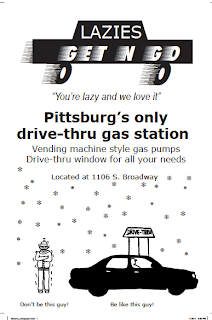
Collegio Ad
Our assignment was to create an ad for the collegio, the size of the ad was up to us as long as we stayed within our budget of $197. My original ad was a different size than my final ad but the final cost was the same. Originally my ad was 6 column inches by 8 inches and came to 192 dollars, which was five dollars under budget. After having Christel look over my current ad she suggested I change it to portrait and rearrange a few things, so my final product does not match my roughs but it looks ten times better.
Specifications
4"X12"=48 48X$4=$192
4 column inches is equal to 7.71 inches
My final ad dimensions are 7.71X12
Target Audience:
My target audience is anyone that goes to gas stations. This includes vehicle owners, cigarette smokers, coffee drinkers, and anyone that needs to pick up something rather than deal with going to wal-mart. I don't think I know of anyone that hasn't been to a gas station for something.
Call To Action:
The call to action is for the target audience to come to this new business.
Copyright:
There are no pictures used in this file, but all images were drawn by me or created in InDesign.
Thumbnails

Rough

Final Ad

Tuesday, October 25, 2011
Inspirations
We were supposed to go out and look for designs that inspired us. These pictures could be of just about anything. I haven't had a lot of time but I did take a few pictures today that I really liked.
 You would be surprised what you find when you just take a little walk in Pittsburg's downtown area. This is a picture of one of the window displays at The Home Place. Each of their window showcases has something different and unique about them. But they are in need of a logo of some sort, this store does not get enough advertisement or publicity.
 This is another window display from The Home Place.
 This is a box of dog snacks I saw while grocery shopping. I like when companies use the brown boxes because it makes it seem like they are recycled and that they are doing their part to be more environmentally friendly. I also love the design that is used on the box, it definitely grabs my attention.


Wednesday, October 5, 2011
Variable data direct mail
Our assignment was to create a variable data direct mail piece which would be sent on a 5"x7" postcard.
The bleed is 0.125" and the margin is 0.25".
The reason for this project is to teach us how to be able to create a file in which we can exchange data by including a instruction file and a excel spreadsheet with the interchangeable data.

Front of postcard with interchangeable image and data
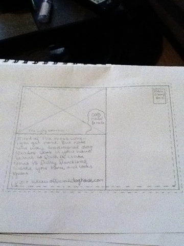 Back of postcard image stays the same but cob changes
Final Piece
 This is my final variable data mail piece, this setup shows all versions of the postcard with the correct text.
Both COB images were taken from dreamstime.com and edited by me.
All other pictures were taken and edited by me, Eva Schenk.
The bleed is 0.125" and the margin is 0.25".
The reason for this project is to teach us how to be able to create a file in which we can exchange data by including a instruction file and a excel spreadsheet with the interchangeable data.
Front of postcard with interchangeable image and data
Final Piece

Both COB images were taken from dreamstime.com and edited by me.
All other pictures were taken and edited by me, Eva Schenk.
Tuesday, September 20, 2011
Blog QR code
 |
| QR Code for this blog |
Don't bother scanning this code because it will lead you right back to where you are. So what exactly is a QR code? It is a two dimensional matrix barcode, that consists of black "modules" that are set on a white background. These codes can be read by QR code scanners, scanned from a smart phone, or a computer with a camera. These QR codes will take you to a specific webpage designated to it. Besides just holding URLs QR codes can also hold text.
Why do we have a need for such barcodes? They make it simple to access a certain area of a webpage without having to type in the URL . For our notepad assignment for example, potential employers may like our work and simply scan the QR code that leads to our blog so that they may view more of the work that we have done.
Subscribe to:
Posts (Atom)